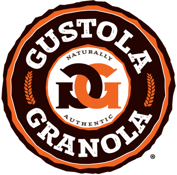
Jim Davis, of Mind*Spark Creative, is the creative designer behind Gustola Granola’s logo. And now that this logo is officially registered with the United States Patent and Trademark Office (USPTO), we thought it might be fun to share a little of the backstory with you.

First, waaaaaay back to 2013, prior to bringing Gustola to our neighborhood farmer’s market for the very first time, I enlisted help from a friend’s nephew (who’d already helped me create a super fun logo for the Mill City Cyclomaniacs youth cycling club). I'm naturally a creative thinker, but my digital execution skills lag. Big time. See my sketches and some ideas from Peter at the end of this post, and the final rendition of the original Gustola Granola logo (2013-2019) here:


Fast forward to 2019, the year we refreshed our packaging slightly, to make it bolder, more playful and POP🧨! Jim has been Gustola’s packaging designer since we first launched in pre-printed pouches in 2016 and had been champing at the bit for years to play around with our logo. Take it away, Jim…

When I was asked to create a new logo for Gustola Granola, I immediately knew the qualities that were important with regard to the brand. I'd known Angie and her brand for several years so it was easy to know how the logo should look. The hard part was making it feel high-end, professional with mass market appeal while still maintaining the handmade, rustic, small town flavor. Plus, I wanted a bold, readable logo that jumped off the shelf.
After studying the competition and what the grocery store granola category looked like, I sketched out several variations of possible logo ideas. I played around with various shapes, but a circle kept showing up in my sketches. A circle (to me) represents wholeness, so it felt right to include it. And to add a touch of the hand-made look, I roughened the circle so it had a slightly jagged form.

Then I experimented with lots of hand-made fonts. But none of them felt right. I needed a font that was playful and organic, yet bold and robust, just like the qualities of the granola. Once I found the perfect font, I played around with the intertwining Gs. I really liked the idea of "hugging" Gs. It made the logo feel like a crest or emblem, which added a touch of sophistication. The connected Gs also symbolize friendship, togetherness, warmth and strength. Then I added the 2 oat icons to represent the natural qualities of the granola.

Selecting colors was easy as brown and orange have always been a part of the brand. All I did was brighten the colors so they stood out more dramatically. There you have it. A logo that perfectly represents what the brand is all about: Fun, delicious, handcrafted and natural.

Naturally and authentically, we’d love to hear your opinions on the Gustola Granola logo. Reach out Jim at jim@mindsparkcreative.com or Angie at angie@gustolagranola.com. That said, now that we’ve jumped through all the hoops to get our logo/mark registered with the USPTO, we’re highly unlikely to make any changes...no matter how outstanding your ideas 😂. Thank you for your ongoing support of our continual attempt to bring you the best tasting, most healthful granola around!


